New Leaving Cert Simulation
There has been a lot of news lately about the new leaving cert grading system and how it stacks up against the old system. Discussion was mostly speculation and theorizing, So I decided to do some analysis of the system myself.
The Old System
The old system consisted of 14 bands to divide up the 0-100% scale the exams were marked on.
| Subject | Grade | Higher | Lower |
|---|---|---|---|
| [90-100] | A1 | 100 | 60 |
| [85-90) | A2 | 90 | 50 |
| [80-85) | B1 | 85 | 45 |
| [75-80) | B2 | 80 | 40 |
| [70-75) | B3 | 75 | 35 |
| [65-70) | C1 | 70 | 30 |
| [60-65) | C2 | 65 | 25 |
| [55-60) | C3 | 60 | 20 |
| [50-55) | D1 | 55 | 15 |
| [45-50) | D2 | 50 | 10 |
| [40-45) | D3 | 45 | 5 |
| [25-40) | E | 0 | 0 |
| [10-25) | F | 0 | 0 |
| [0-10) | NG | 0 | 0 |
A students score is the sum of their top 6 subjects, with a maximum of 600*.
*There is an extra 25 points for taking higher level mathematics, but for simplicity i’m going to ignore this in the analysis
The New System
The new leaving cert grading system introduces a reworked and renamed set of grades, with a new points distribution over those bands.
| Subject | Grade | Higher | Lower |
|---|---|---|---|
| [90-100] | H1/O1 | 100 | 56 |
| [80-90) | H2/O2 | 88 | 46 |
| [70-80) | H3/O3 | 77 | 37 |
| [60-70) | H4/O4 | 66 | 28 |
| [50-60) | H5/O5 | 56 | 20 |
| [40-50) | H6/O6 | 46 | 12 |
| [30-40) | H7/O7 | 37 | 0 |
| [0-30) | H8/O8 | 0 | 0 |
Again a students score is the sum of their top 6 subjects
A quick glance shows the new systems is more regular, with even 10% intervals, and lumps all the redundant zero bands together.
It also gives less points for those taking lower level subjects, encouraging people to take the higher level exams.
The most controversial change is the lowering of the fail grade from 40% to 30%, meaning you can get 70% of your exam incorrect and still be rewarded.
The Simulation
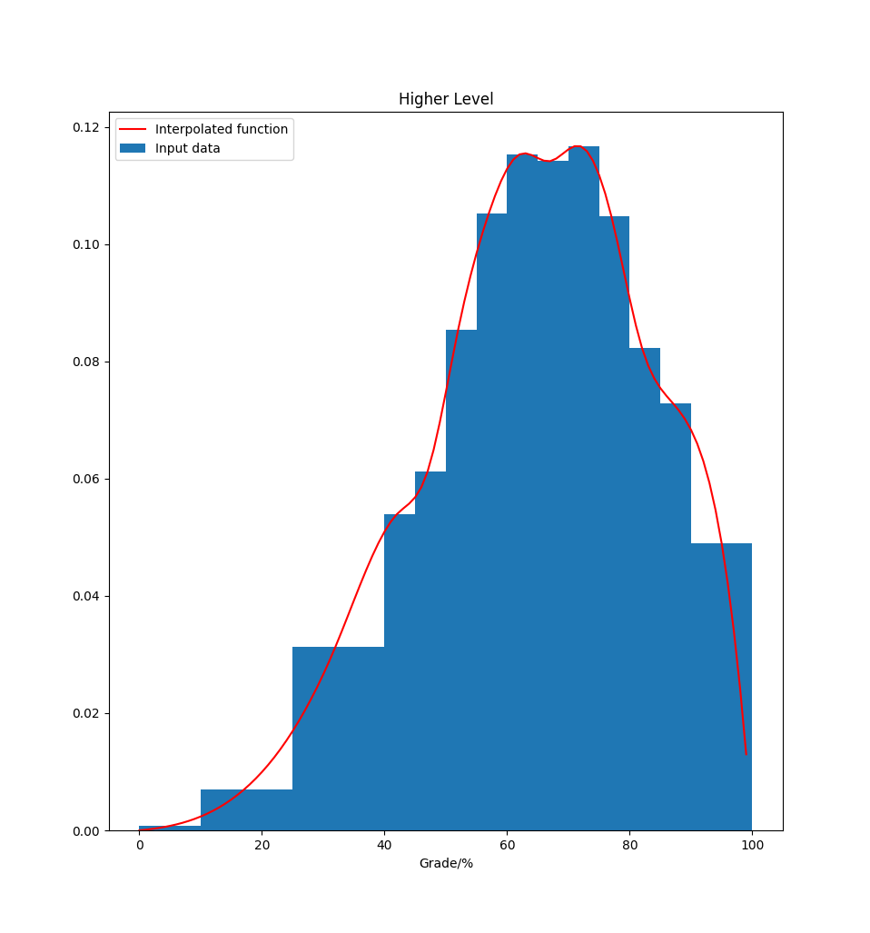
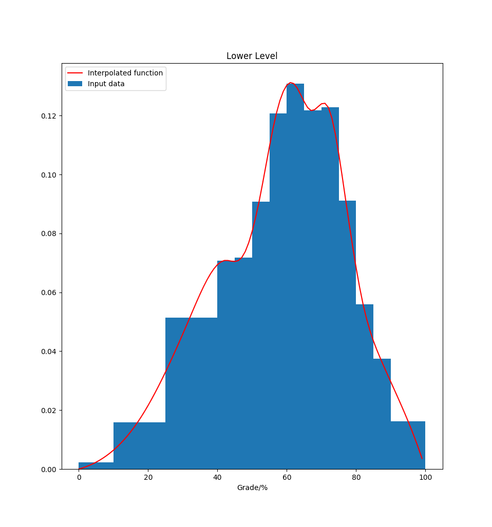
To dig deeper and get some real results from the data I decided to use the available statistics from previous leaving cert years to run a Monte Carlo simulation, re-binning the results into the new bands to get the new points
The department of education provides an excel file with detailed histogram data of global performance in each subject here
A = Ardleibheal = Higher level, B = Bonn leibheal = Foundation, G = Gnathleibheal = Lower
Using this data we can use cubic interpolation to derive a continuous function to describe the discrete input.
Higher Level
Lower Level
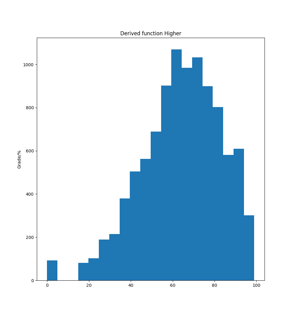
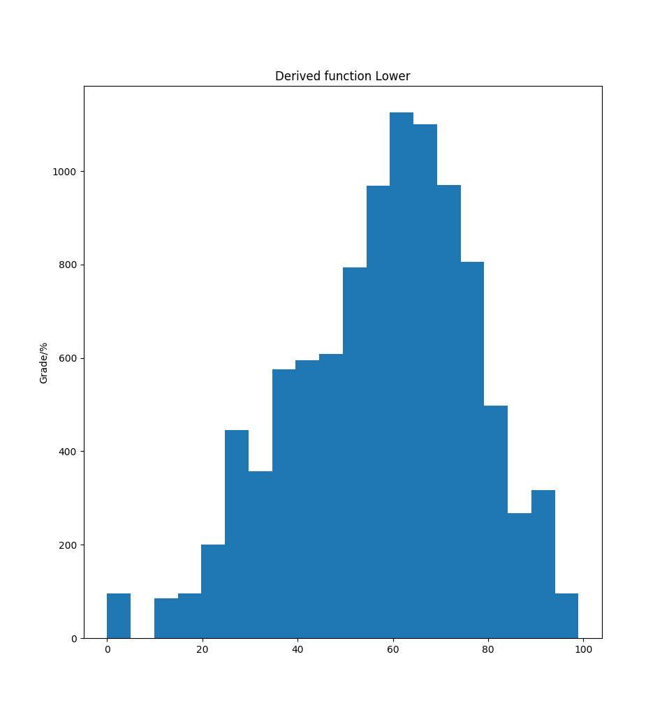
By integrating under the continuous functions we can come up with an inverse function mapping the range [0-100] to percentages
Higher Derived Function
Lower Derived Function
Simulating a student
For privacy reasons there is very little info on the performance of individual students, only global statistics. This makes it tricky to simulate the grades of one student. Students don’t perform randomly on a global scale, taking one student the standard deviation of their grades is going to be much lower than the overall deviation of the population.
Randomly selecting a percentage representing how they perform on average and then varying within a small range close to that score works quite well and matches the real statistics very closely.
Also having a distribution that matches how many lower level exams a student takes is required, from the statistics we can see that the average is ~2.8, but there are many students who take 0 and many who take 6. Again unscientifically picking a distribution that matches the real world closely worked well
The next step is to run a full Monte Carlo simulation of a leaving cert year, and then to take each students results and calculate their points on the new and old system
The Results
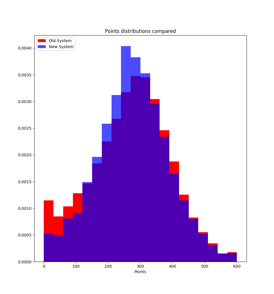
The immediate stand out feature is the reduction in low points, this is presumably due to the points receivable for getting between 30 and 40% now.
The overall picture seems to be a reduction to the mean
Adding in a check to the code to track the difference between each students score between years reveals some initially shocking stats.
The largest increase from old to new system is 222 points for one student, over one third of all points available, and the largest drop recorded is 24 points
The 222 point increase seems way too large, but if you print the actual grade distribution you’ll see that its a student scoring 30-40% in all 6 higher level exams, meaning on the old system they would score 0 points, but on the new system they get 222.
The drop of 24 points comes from any student who does very well in lower level exams but poorly in higher level exams, which mirrors the fact that the points have been reduced for lower level exams this year
Taking the average delta between all students we see that the average is a drop of 8 points
Conclusion
The new system is not a drastic change from the old, and comes with advantages and disadvantages. Reducing and regularising the bands makes it easier to tell what band you are in, but they have made the points more difficult to calculate by picking multiples of 11 for each band
The new system appears to reward failure by allowing for points for students getting 30-40%, although coupled with the reduced lower level points it could be argued that it’s encouraging the adoption of higher level exams
Code used available here